Share

Check out Shepard’s new interview with Fast Company on Art, Advertising, and Propaganda below.
POST-“HOPE” POSTER: SHEPARD FAIREY ON ART, ADVERTISING, AND PROPAGANDA
BY HUGH HART
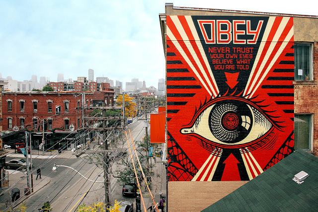
Shepard Fairey likes to describe his politically charged posters, paintings, and murals as “propaganda,” but propagation, by any means necessary, plays an equally important role in the Los Angeles artist’s operating philosophy. The approach dates to 1989, when Fairey, inspired by punk rock and skateboard DIY culture, reworked a randomly selected photograph of actor Andre the Giant. The image went viral the old-fashioned way, spread by Fairey and his fans via stickers, stencils, rubber stamps, and wheat-paste posters. Paired with the slogan “Obey,” lifted from 1988 horror film They Live, Fairey made his mark in cities all around the world with these cryptic signifiers of mindless authoritarian culture.
Fairey’s gift for crafting uncommonly catchy imagery culminated in 2008 when his “Obama Hope” poster became the decade’s most iconic piece of political advertising. Created in less than a day, the mixed-media stencil original now resides in the Smithsonian Institution’s National Portrait Gallery.
Before and after “Hope,” Fairey “bombed” dozens of unauthorized locations, resulting in roughly 18 arrests. At the same time, the South Carolina native figured out how to parlay his signature style into art marketing juggernaut Obey Giant Industries, which organizes his gallery paintings, limited-edition prints, mural commissions, and graphic design projects.
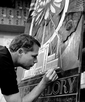
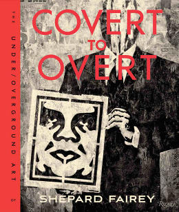
Fairey keeps it coming in Covert to Overt. The hard-cover picture book showcases recent works rendered with pinpoint precision and aimed with a subversive eye toward all things Americana. A few days before heading for Philadelphia to make prison reform-themed murals, Fairey took a break from signing prints in his Los Angeles studio to answer questions about his “OBEY” brand, Sex Pistols lyrics, and the magic of murals.
Co.Create: Does the title Covert to Overt signify a move from unauthorized street art toward more commercial work?
I’ve always used what I call the “inside/outside” strategy inspired largely by the do-it-yourself ethic of punk rock. I work outside the system, but I’m also willing to infiltrate the system to improve it from within whenever possible. My practice began by doing things on the street, but now I have a lot of opportunities to do sanctioned pieces, so I look at Covert to Overt as being about the range of approaches I take to my work.
You seem to embrace the artist-as-brand concept by using “Obey” and Andre the Giant logos almost like trademarks in an ongoing ad campaign. Do you like your work to have this kind of fixed identity?
I think my body of work benefits from its cumulative effect beyond the impact of individual pieces. I have long called what I do a campaign in that I definitely borrow from the successes of advertising, but I do so in a way that’s driven much more by social commentary than commercial stimulation. In some ways, I often speak the same language as the things I’m critiquing. The ultimate success of my campaign would be its obsolescence.
Some of your artwork seems to take cues from the kind of peppy American advertising and illustration that were popular half a century ago. Why do you like to channel, or subvert, that kind of message-making?
Midcentury Norman Rockwell-style art presents an appealing fantasy that has a seductive nostalgia, but also gives me a great way to satirize and critique and illuminate the wide gap between the promise of the American dream and the reality for many people.
You have a knack for finding concise slogans to match your graphic design. Which comes first: the words or the image?
It depends. Sometimes I think of a slogan first and struggle with how to render it. Other times, as the image itself gets more resolved, I add text to amplify or explain the concept and make the image stronger. I usually have a few options, and ask my wife and coworkers what they like. Sometimes, I’ve spent so much time with the words and images that nothing looks good to me anymore and I need fresh eyes, so I’ll set it aside for a day or two.
Your text-driven pieces draw much of their power from a very specific political perspective. Who influences your critiques of society?
Everyone from George Orwell and Noam Chomsky to Naomi Klein and even Russell Brand. I’m also very inspired by musicians who have a gift for evocative imagery and succinct lyrics, like Joe Strummer, Neil Young, Bob Marley, Chuck D from Public Enemy. I often use lyrics as a point of departure in my art pieces. For example, I use “Paint It Black” by the Rolling Stones in an oil-themed image. And I used the Sex Pistols’ “Cheap Holiday in Other People’s Misery” in an Iraq invasion-themed piece.
Your fondness for music extends to record covers inspired by old-timey album art going back nearly a century. What attracted you to that period of graphic design?
As a printmaker, I appreciate working with the technical limitations of printing and materials. Early records had foil-stamped labels, which meant that the design had to work well with one color. When I started on my record cover series, I decided to unify them by printing with one color. Labels from 1910s through the 1930s provided a lot of inspiration, but I often updated them with more current motifs and references. Much of my work is a hybrid of things I like from different eras, which I then try to combine them in a way that feels fluid and cohesive rather than anachronistic.
Billy Idol talks in the book about Russian Constructivists being an influence, and your company describes its mission as “Worldwide Propaganda Delivery.” Are you interested in “brainwashing” viewers of your work by juxtaposing familiar material in weird ways?
When Billy and I first met, we bonded over a mutual love over Russian Constructionism. I love propaganda art from many countries and consider my own work to be propaganda because it’s designed to influence people so they see my point of view on issues. Propaganda has a negative connotation because it’s usually used to manipulate people into accepting [its message] as the last word on an issue. However, I like to think that my propaganda is the start of a conversation, not the end.
At a point in your career where you could clearly stick with gallery pieces and commissions, you continue to do street art. What’s the physical risk?
“One time, I dropped six stories from balcony to balcony on a building only to be beaten up by the police when I got to the ground. I try to avoid those situations now. I’ve ended up with plenty of cuts from barbed wire and glass, bruises from various hard-to-traverse surfaces, but I’ve been very lucky not to hurt myself seriously. Around the time our first daughter was born 10 years ago, I began to have dreams that people who came out with me fell off fire escapes or roofs. I’m not Sigmund Freud, but I think that maybe came from my own anxiety about staying safe so I can be a father for my daughter.
Covert Overt documents your creative output from 2011 to 2015. How does this work reflect an evolution in your operating philosophy from the time that you first started putting up stickers and wheat paste-ups back in 1989 and in the ’90s?
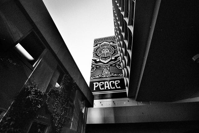
The most substantial evolution over the past five years has been my large-scale painted murals. Prior to 2010, almost all of my murals were wheat-pasted, which is fast and efficient but not durable. Since 2010, I’ve painted 55 large murals. Nothing lasts forever, but these painted murals can last for many years, so to me, it’s worth the extra effort.
Murals contribute such a great energy to urban life. What is the specific rush you get from murals that you don’t perhaps get from other media?
The most exciting thing about murals is that they are confrontational based on scale alone. I’m a big believer in the idea that the passion of the application transfers to the viewer. If I put art in a daring spot, it’s more moving to the viewer and demonstrates my conviction. And art-based murals remind the viewer that the cityscape can be a canvas for expression, not just commerce. I love the challenge of executing a large mural. I imagine it’s the same satisfaction mountain climbers get ascending challenging terrain. It takes pure physical effort to do murals, which some people with great talent aren’t willing to give.
When it comes to your murals, who do you take inspiration from?
I love everything from well-painted vintage advertising murals to Keith Haring and Mexican muralists like Orozco and Diego Rivera. In recent years, I’ve been very inspired by contemporaries like JR, OSGEMEOS, Vhils, and D*Face.
The “Hope” poster you created for Barack Obama’s 2008 campaign is arguably the most iconic political American image of the century, but it also created legal headaches for you when the AP sued for copyright infringement for using one of their photographs as a foundation for the image. How did that case impact your approach?
I’m a little more cautious now, but I still believe that working from reference material is valid. I also collaborate officially with photographers just as I did for many years before the “Hope” poster. The AP lawsuit was a learning experience. I believe in copyright but I also believe that my approach to the “Hope” poster was transformative illustration, not appropriation and no different from the approach taken by many works that are highly regarded by art historians. I’m proud of the “Hope” poster as a tool of grassroots activism that hopefully empowers people to feel like they can make a difference even if they don’t come from a position of wealth or power.
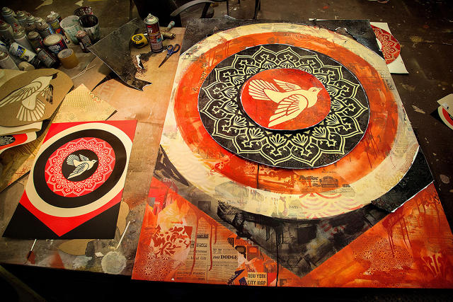
The “Hope” poster features a very tight color palette, as does most of your work. Why does so much of your work only use red, black, and white?
It’s mostly about continuity. The palette was originally dictated by my low-budget existence when I first started out, because the copiers at Kinko’s in Providence, Rhode Island, where I went to school only had a red toner cartridge and a black toner cartridge. Even though I have more resources now, I think simplicity and continuity are assets, and the colors I generally use are very effective at grabbing attention.
Your politically charged work critiques pollution, mindless consumerism, corporate abuse of power, social injustice—there’s so much dysfunction to pick from, how do you arrive at your themes?
Sometimes like-minded organizations approach me and I make an image for them based on our shared philosophy. Other times, I make an image and offer it to a group. People ask me if I’m an activist, and my answer is no. I’m an artist with a point of view, but I want to do my part to supplement activist causes I believe in. I feel fortunate to connect with people who find my imagery useful and help spread it.
With your collages, you often embed subliminal messages for those who look closely. Do you design those pieces to resonate on different levels?
Absolutely, especially with my paintings. I like the idea of an image that registers immediately from a distance but also has many supplementary layers upon closer examination. In my paintings, I often mimic the layers of accumulated and decaying paper on a city wall by using newspaper clippings, wallpaper, and other graphics that have a relationship to the dominant narrative of the piece. I like the idea of certain elements being digested quickly in a piece, while others take much longer to soak in.
The book celebrates pieces made with letterpress, silk screen, stencil, paints. How do you see these analog techniques fitting into the 2015 digital media landscape?
Analog things have a charm in their imperfection because it feels more human. I use a computer as part of my design process, but my least favorite way of experiencing art is through the computer. These days, it’s very easy to generate imagery digitally, but to make actual tactile art objects is a visceral experience. i think it’s more active both in its creation and in the interaction with its audience.